20250123-2305. This time I’m trying theme Brightblog! I love the colors and how the top of the exclamation point is angeled/skewed slightly to the right!
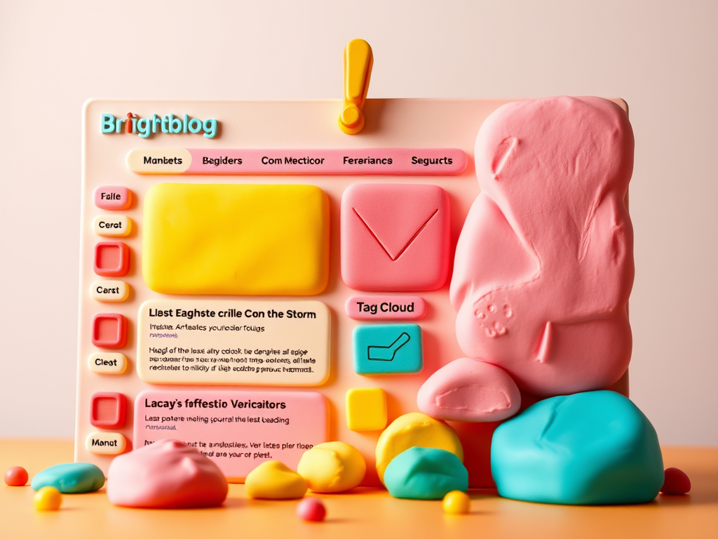
I completely forgot about using sidebars and I liked the theme’s left sidebar. For this Sidebar Content, I used the following blocks/widgets in the usual order:
- Latest Posts
- Latest Comments
- Archives
- Calendar
- Categories List
- Tag Cloud
- Blog Stats
For the Top Section of this sidebar, I reused my customized Header from Theme 2025. I felt or sensed that I really don’t need my readers to see too many links, which are available for the most curious anyways.
So for Navigation menus, I made use of the Overlay Menu feature to always be turned-off. I have one triple-decker hamburger for my internal links of mostly pages and two double-decker hamburgers for my external links: blogroll and social media.
Furthermore, I completely forgot about my favorite plugin that functions like the Overly Menu feature of the Navigation block/widget that collapses by default or has the option to be opened by default.
So now instead of seeing the left sidebar menu and the two footer columns, all three are collapased/hidden/turned-off. This preference allows readers to focus on the blog post itself and to NOT be bothered/distracted with other contents found in the sidebar and/or footer sections.
Instead of my preferred front and center lone post from Theme 2025, the Brightblog theme sets-off my lone post towards the right and its Featured Image to its left!
I keep forgetting to use the AI-generated feature to plugin the Featured Image to each post entry. This might help the readers have a better idea what I’m talking about with an image instead of just “texting” my thoughts.
I’ll just have to get used to blogging with images from now on; since this Brightblog theme draws-in the audience via the Feature Image and towards the main focus of any blog – the posts.
Anyways, below the main blog post section is the Footer Wrapper section which is huge and has two columns.
I made use of the right Footer column (which is set to 60 percent): and that’s what I liked for my KJV Bible links (in alphabetical order for when I need to look-up quickly a “book” or passage while listening to and following along with a “preacher” online).
The left Footer column is generic and set at 40 percent. I made use of this wide empty space for our introduction. I may use one of my AI-generated images meant for Site Icons or whatever. Furthermore, I reused my customized Foother from theme 2025 and inserted that beneath Footer Wrapper section.
Overall, I like the huge fonts and colorful schemes. If I only knew how to code the background colors, then that would be many hours of fun. But for now I’ll just customize the Global Settings next time – if I have the time. I just remembered I could customize the color palette here, too! Sheesh.
Anyways, I took six screenshots of the different Global Styles available for the Brightblog theme. Unfortunately, the following gallery has some sort of opaqueness that I can’t get rid of.
Currently, I’m using the Default Global Style and I’ll have fun switching among the other five styles.
You could click each image to see its true colors. The fancy names are called Default, Coral Dreams, Forzen Pink, Kiss Goodbye, Mint Boneyard and Peachy Ocean. I do NOT know how y’all come up with these fancy names! But I like it!


That’s all for now. I’ll have to keep editing my weblog site (again). End of status report 2347 PST. Edited 2355 PST.
Leave a Reply